SILVERandBLUE Coffee Program
2023
Category: Brand Identity
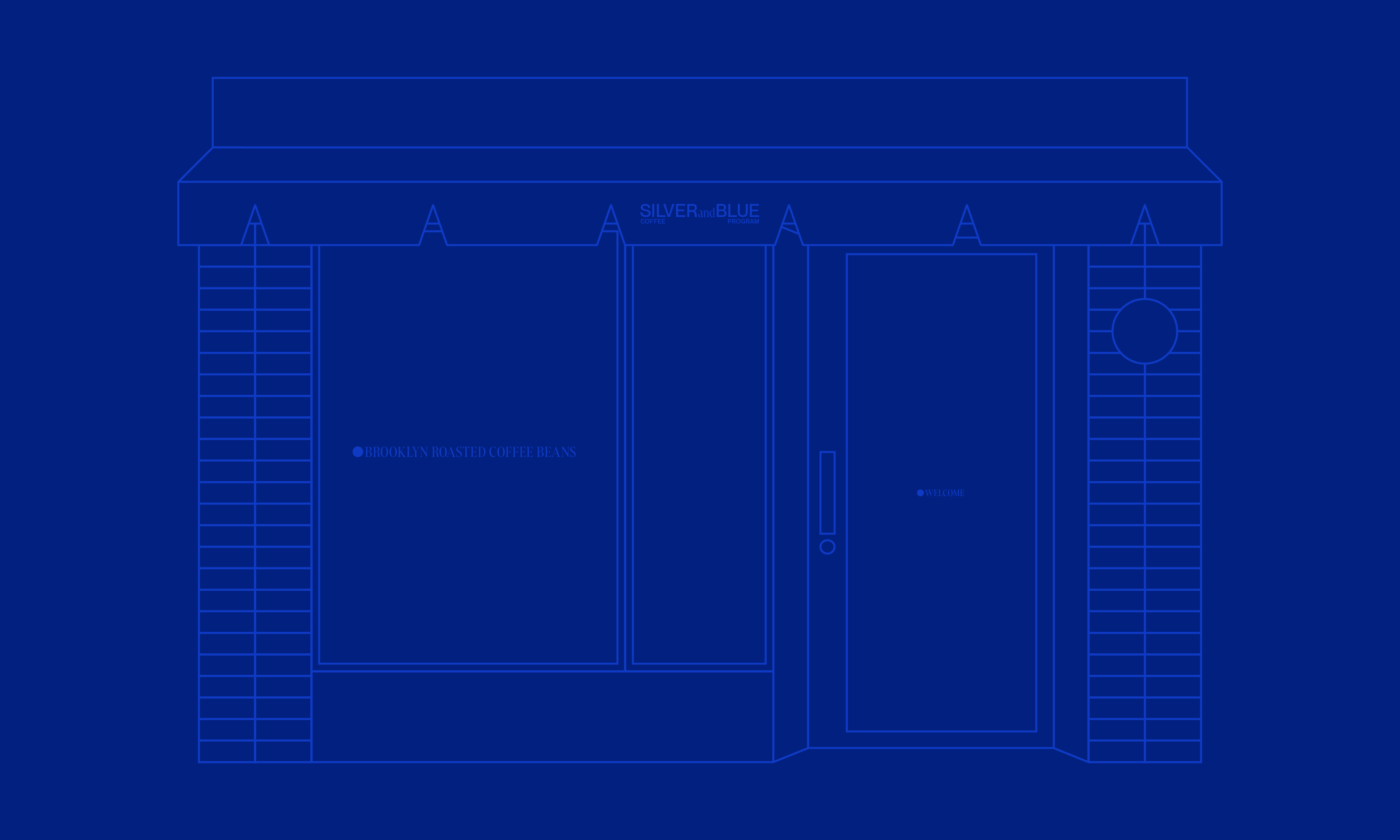
SILVERandBLUE is a coffee roasting brand based out of Brooklyn, NY and is inspired by the vibrancy of coffee and the many places in which it comes from.
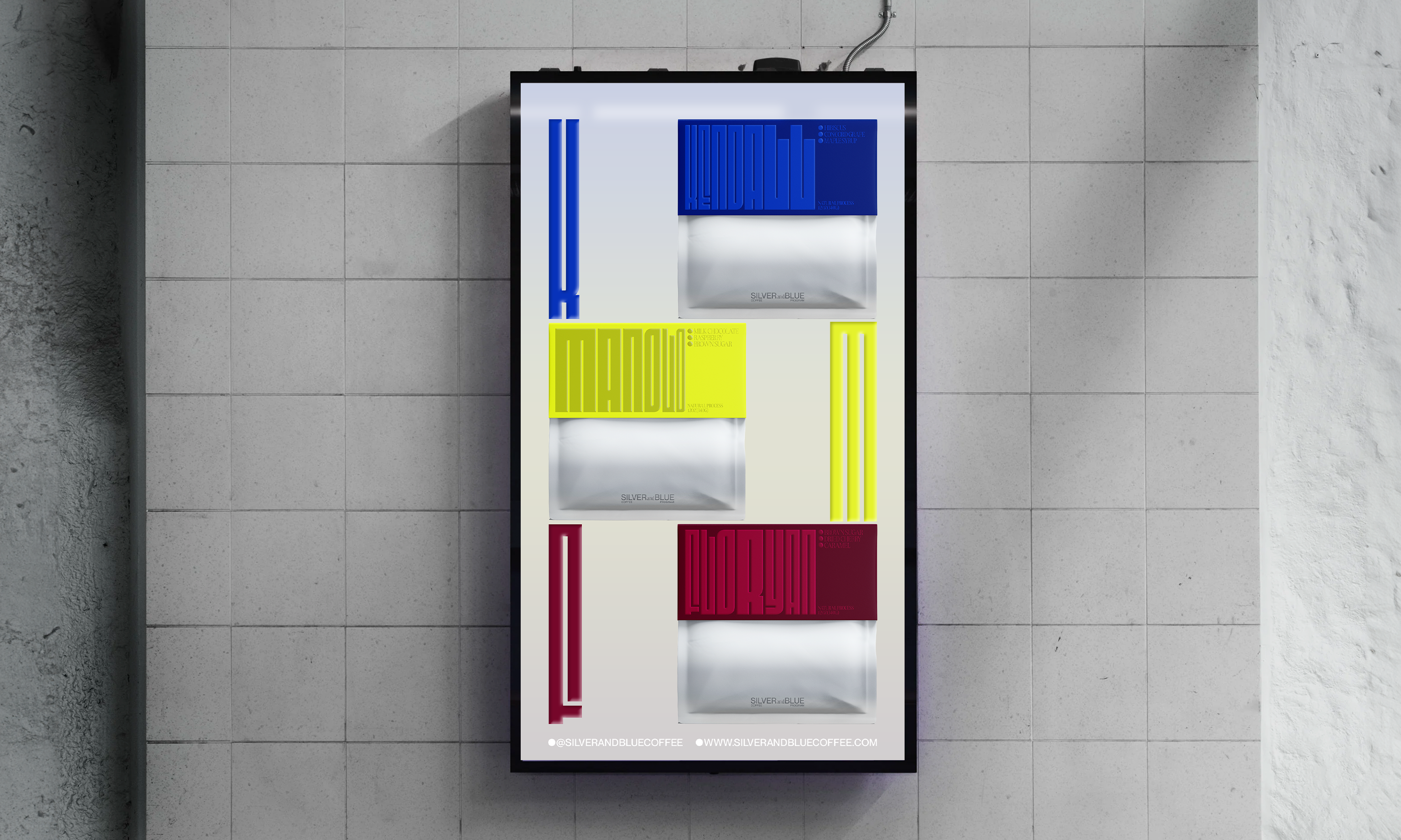
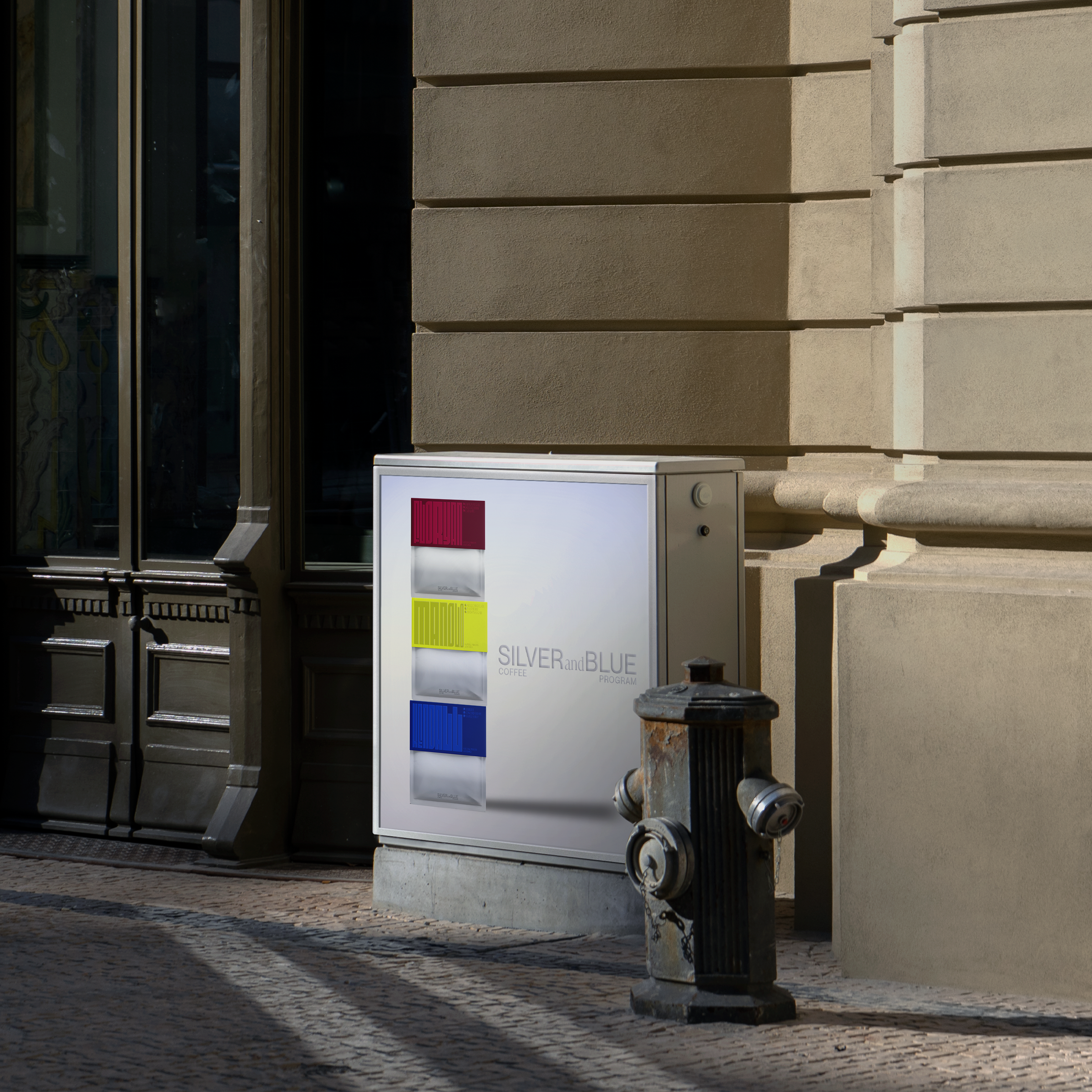
The brand identity is designed to capture the energy and versatility of the three different bean types from SILVERandBLUE. The system was created around two main elements — rich colors and versatile typography.
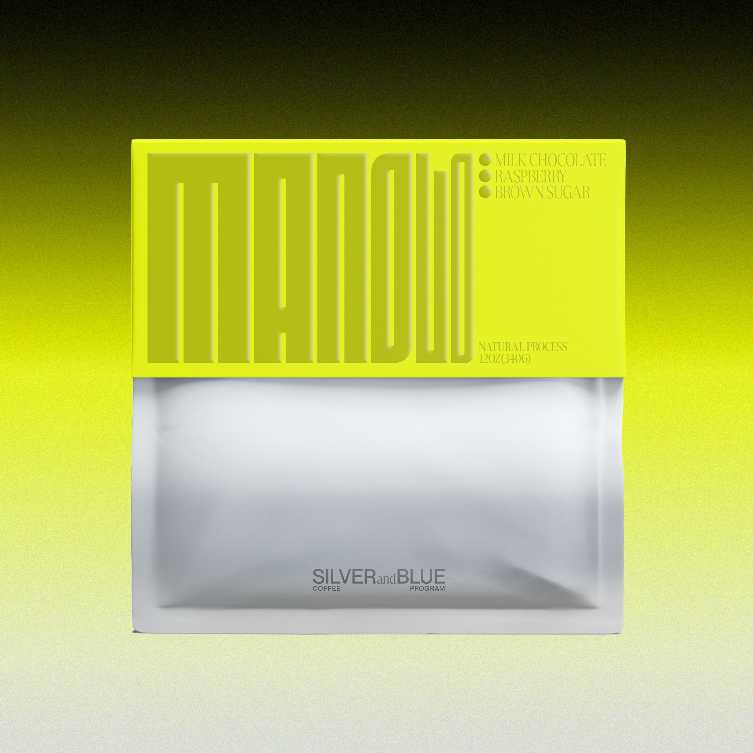
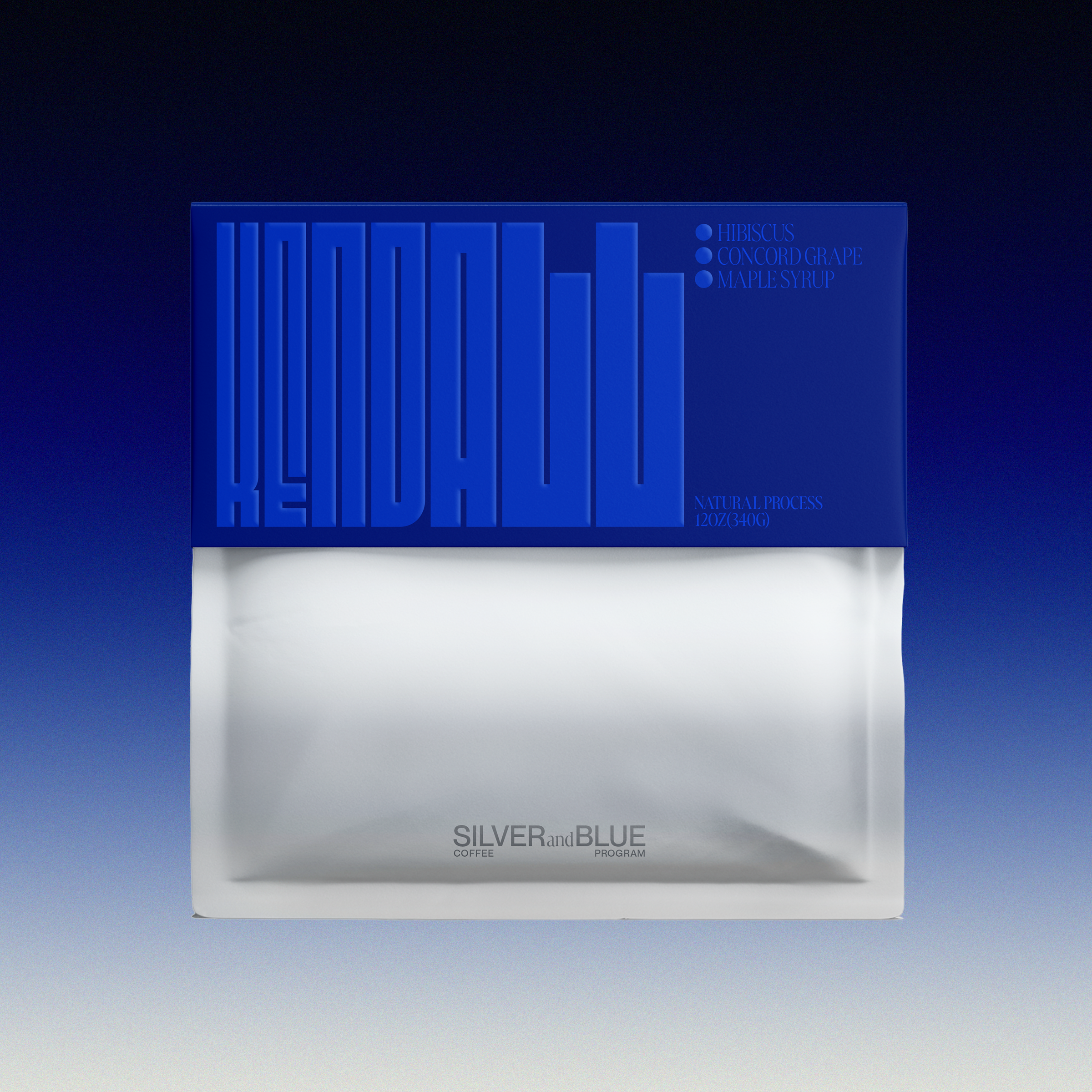
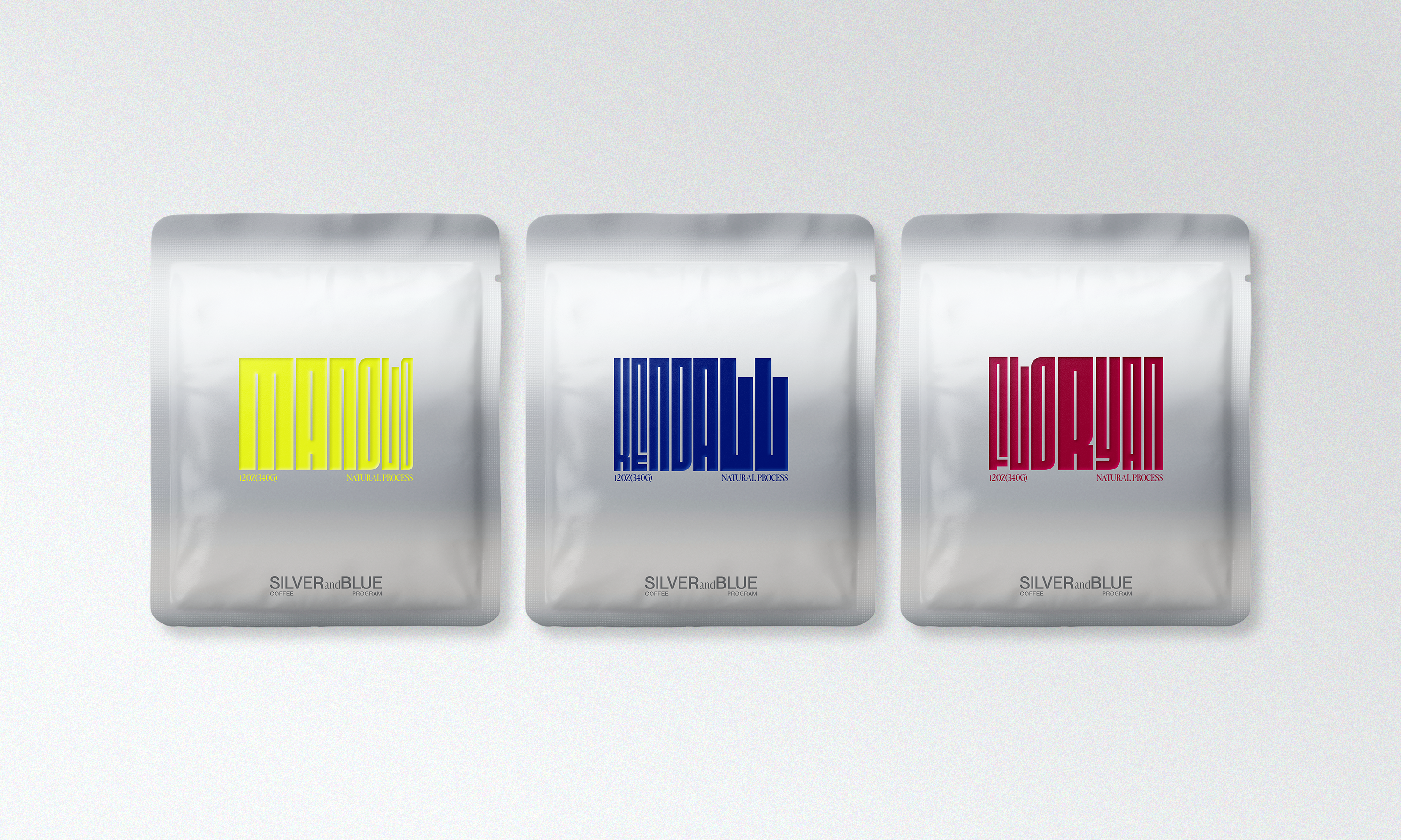
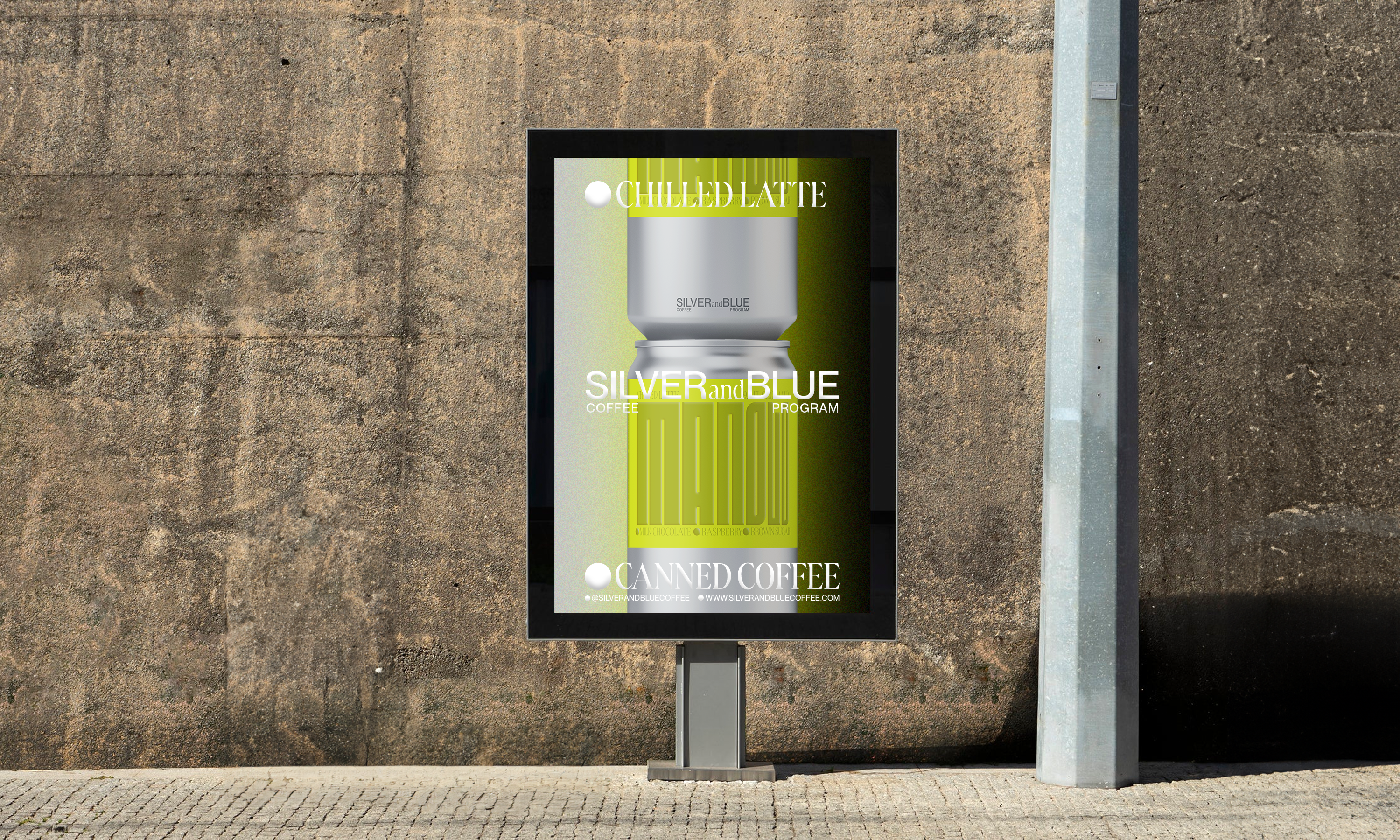
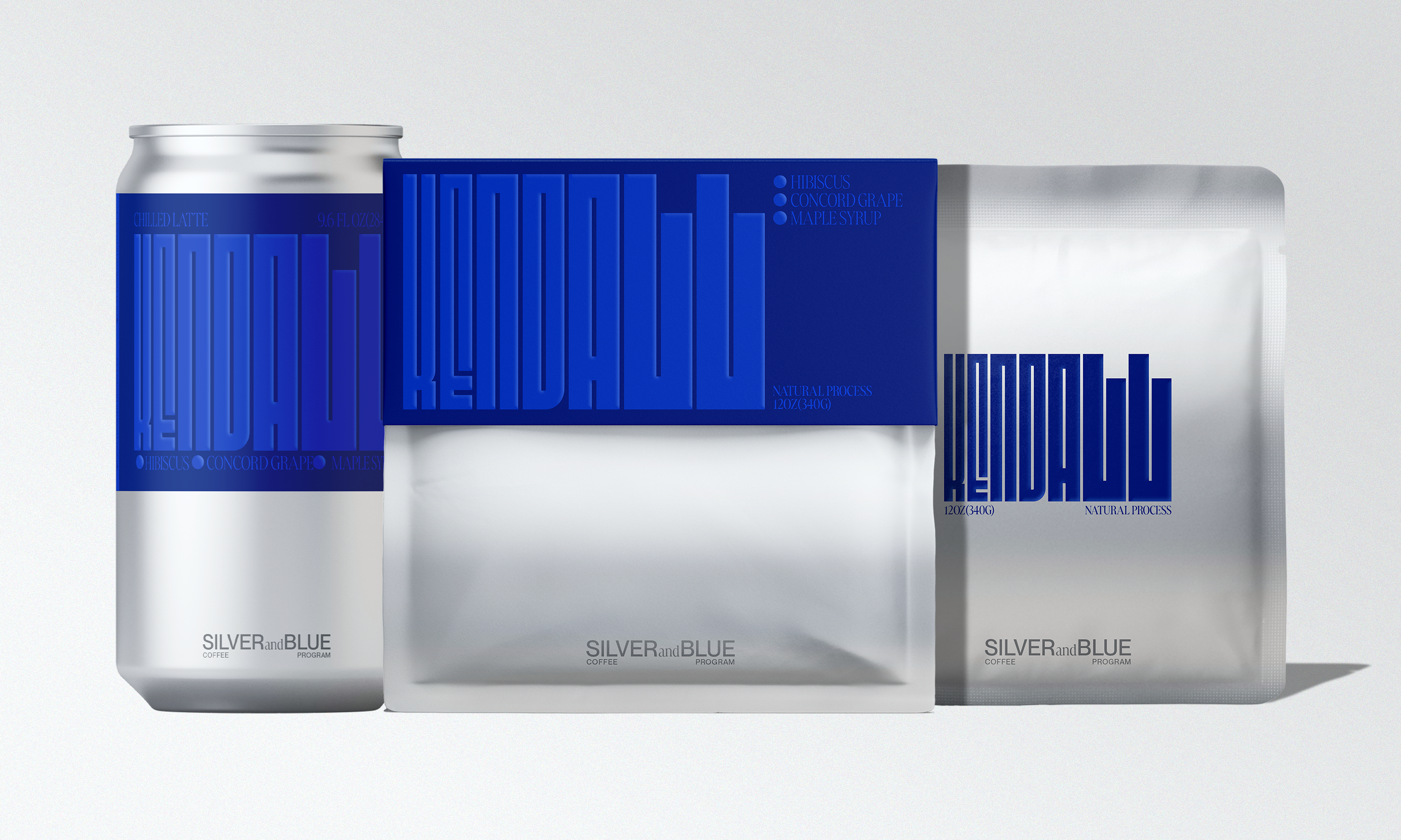
The choice to use a typeface that is variable and has a range of different widths came from the idea of representing the sturdiness of the coffee and versatility that comes from the three different coffee beans: Manolo, Kendall and Floryan. With the colors that were chosen, I wanted something that had a deep, yet vibrant color palette with complimentary hues to convey the vibrancy of the coffee beans.
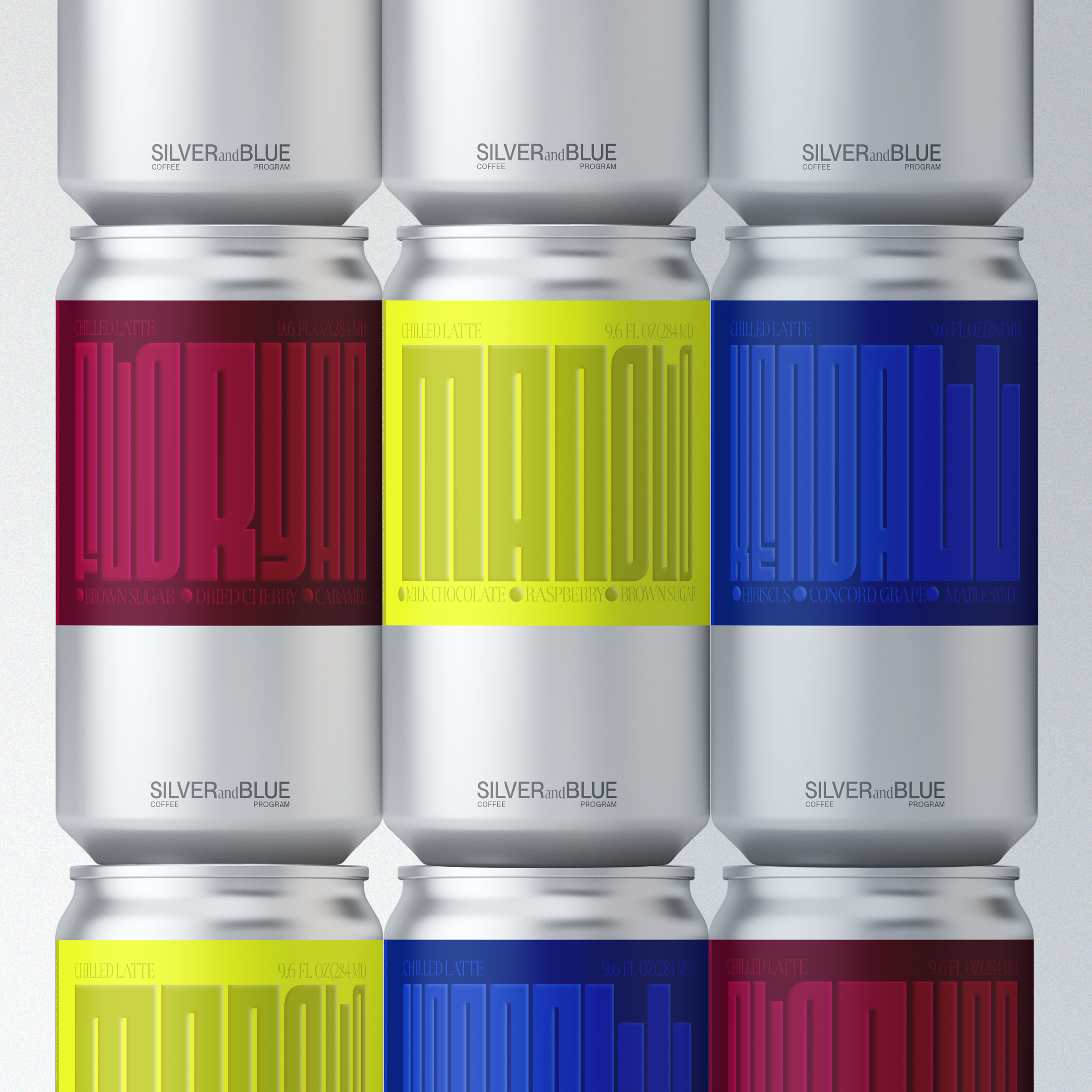
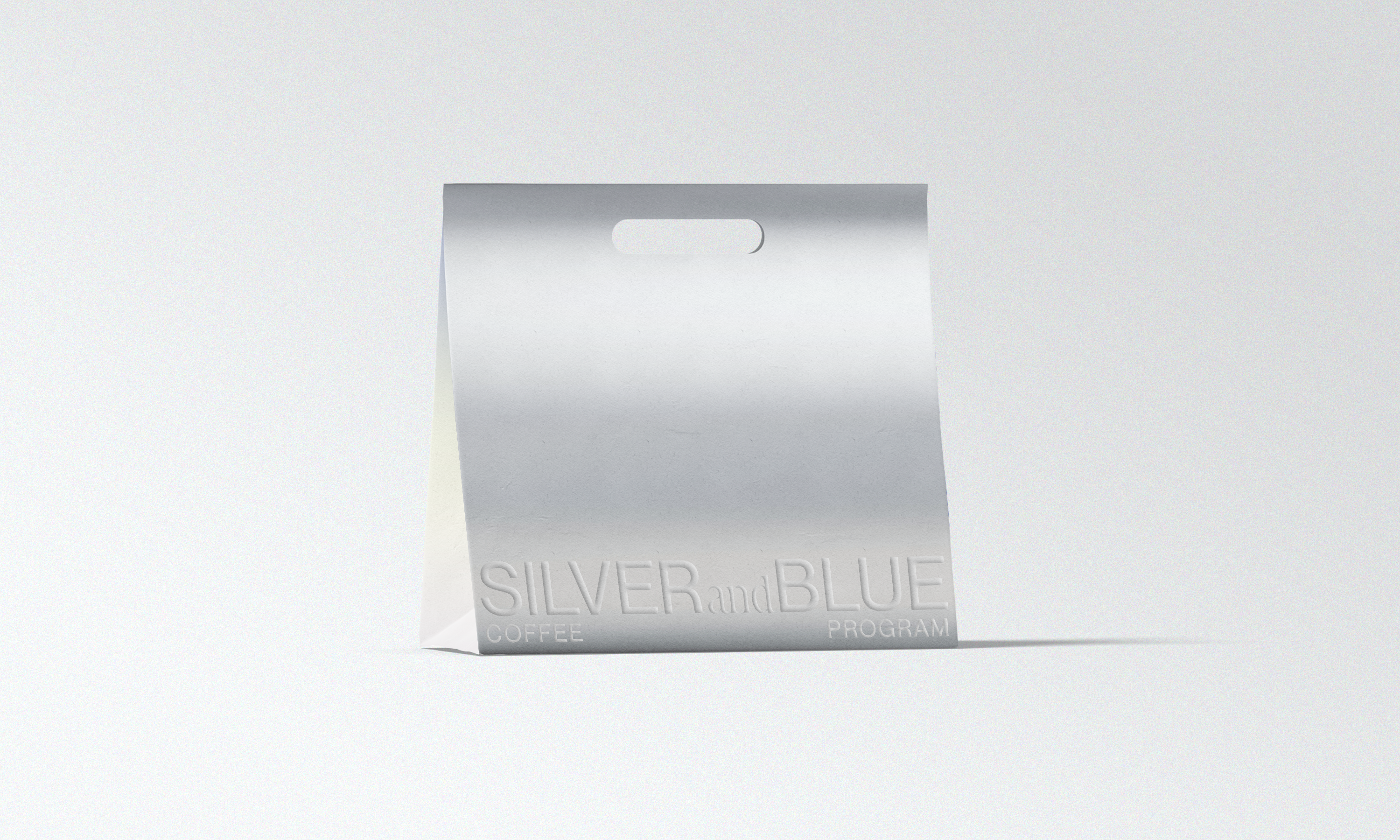
The packaging itself maintains a simple design; the box that the beans come in has an aluminum shell with a lid that features the color associated with each of the three coffee beans. The lid itself dawns the name of each bean embossed with its flavor notes alongside. The interior aluminum bag inside contains the beans, with a card that breaks down the tasting notes and process for the respected bean. With the canned versions of the coffee, the design is complimentary in its simple, yet bold approach in its aluminum can and bold colors.
Fonts
Marlide by Kontour
Fit by DJR
SILVERandBLUE is a coffee roasting brand based out of Brooklyn, NY and is inspired by the vibrancy of coffee and the many places in which it comes from.
The brand identity is designed to capture the energy and versatility of the three different bean types from SILVERandBLUE. The system was created around two main elements — rich colors and versatile typography.
The choice to use a typeface that is variable and has a range of different widths came from the idea of representing the sturdiness of the coffee and versatility that comes from the three different coffee beans: Manolo, Kendall and Floryan. With the colors that were chosen, I wanted something that had a deep, yet vibrant color palette with complimentary hues to convey the vibrancy of the coffee beans.
The packaging itself maintains a simple design; the box that the beans come in has an aluminum shell with a lid that features the color associated with each of the three coffee beans. The lid itself dawns the name of each bean embossed with its flavor notes alongside. The interior aluminum bag inside contains the beans, with a card that breaks down the tasting notes and process for the respected bean. With the canned versions of the coffee, the design is complimentary in its simple, yet bold approach in its aluminum can and bold colors.
Fonts
Marlide by Kontour
Fit by DJR