2023
Category: Brand Identity
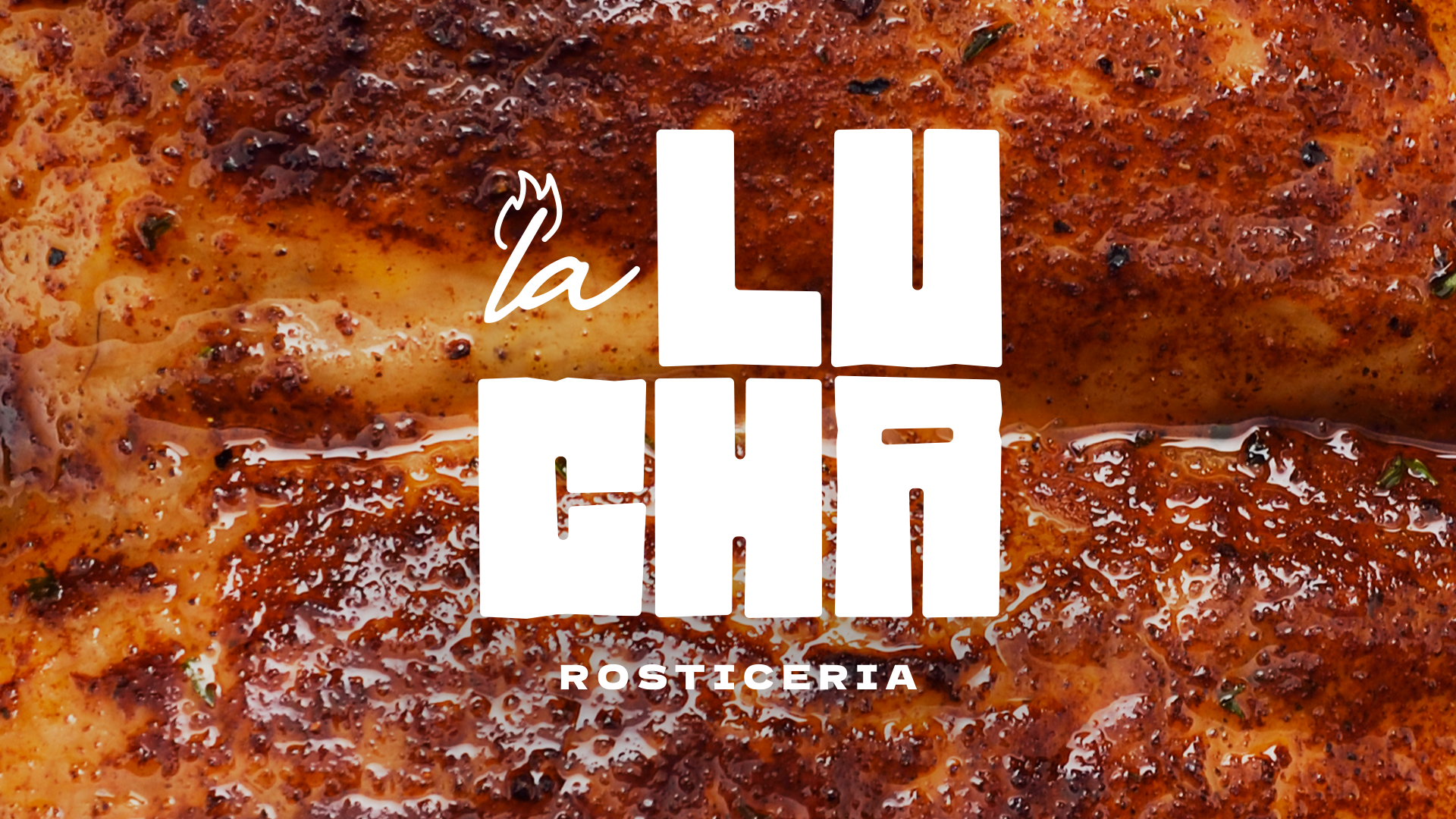
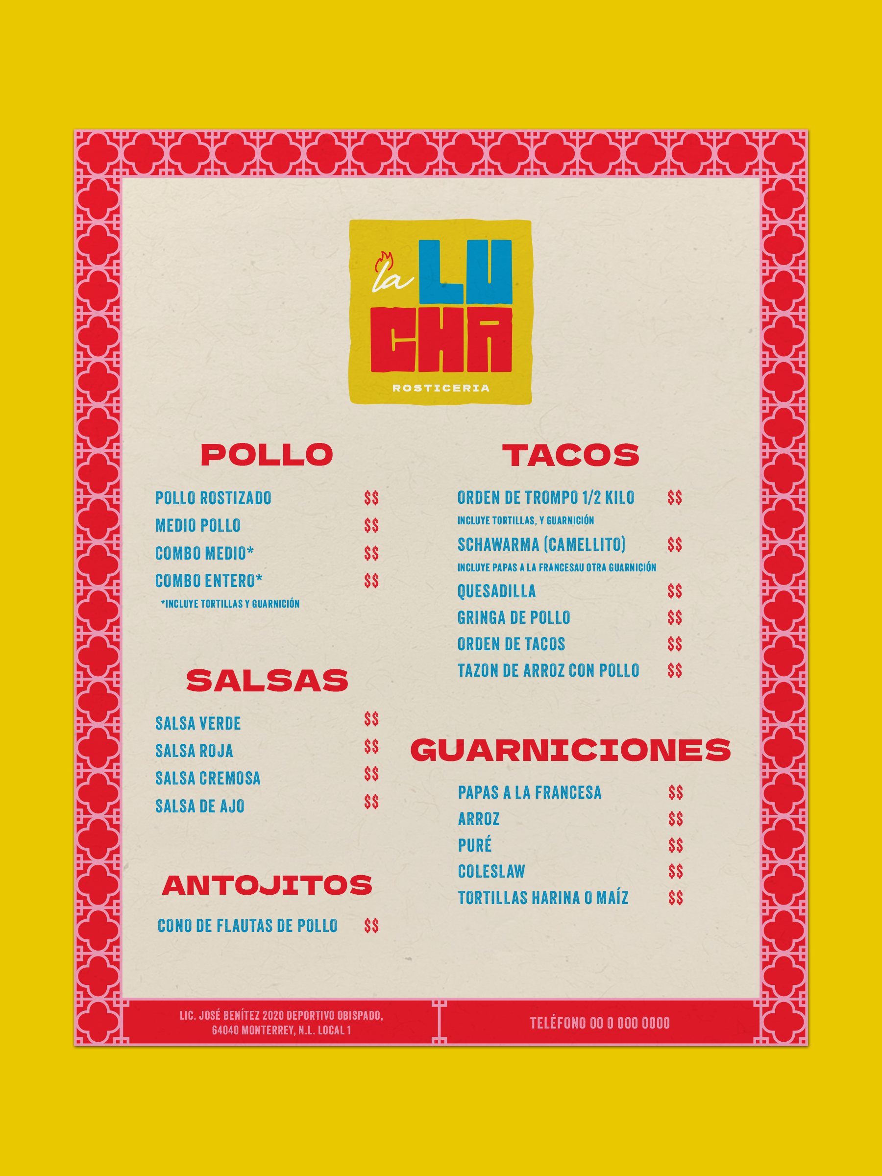
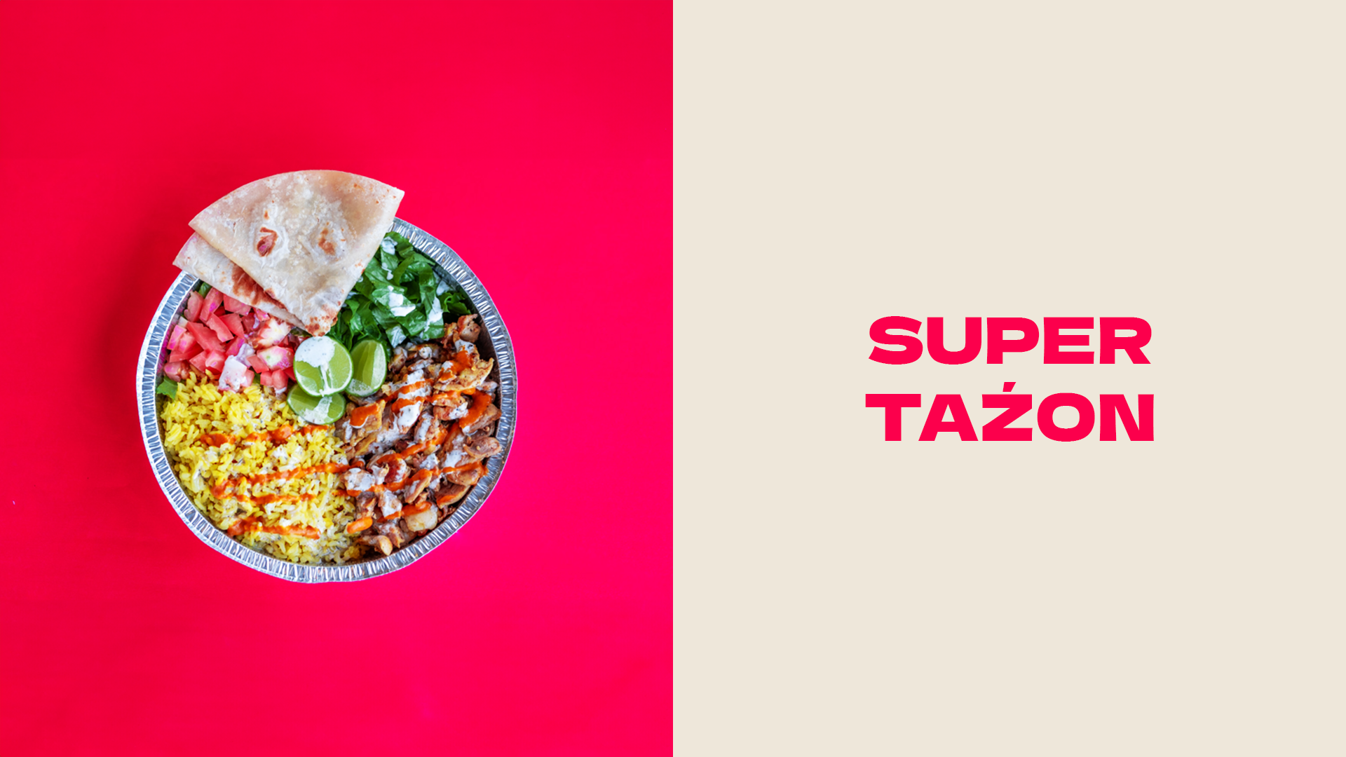
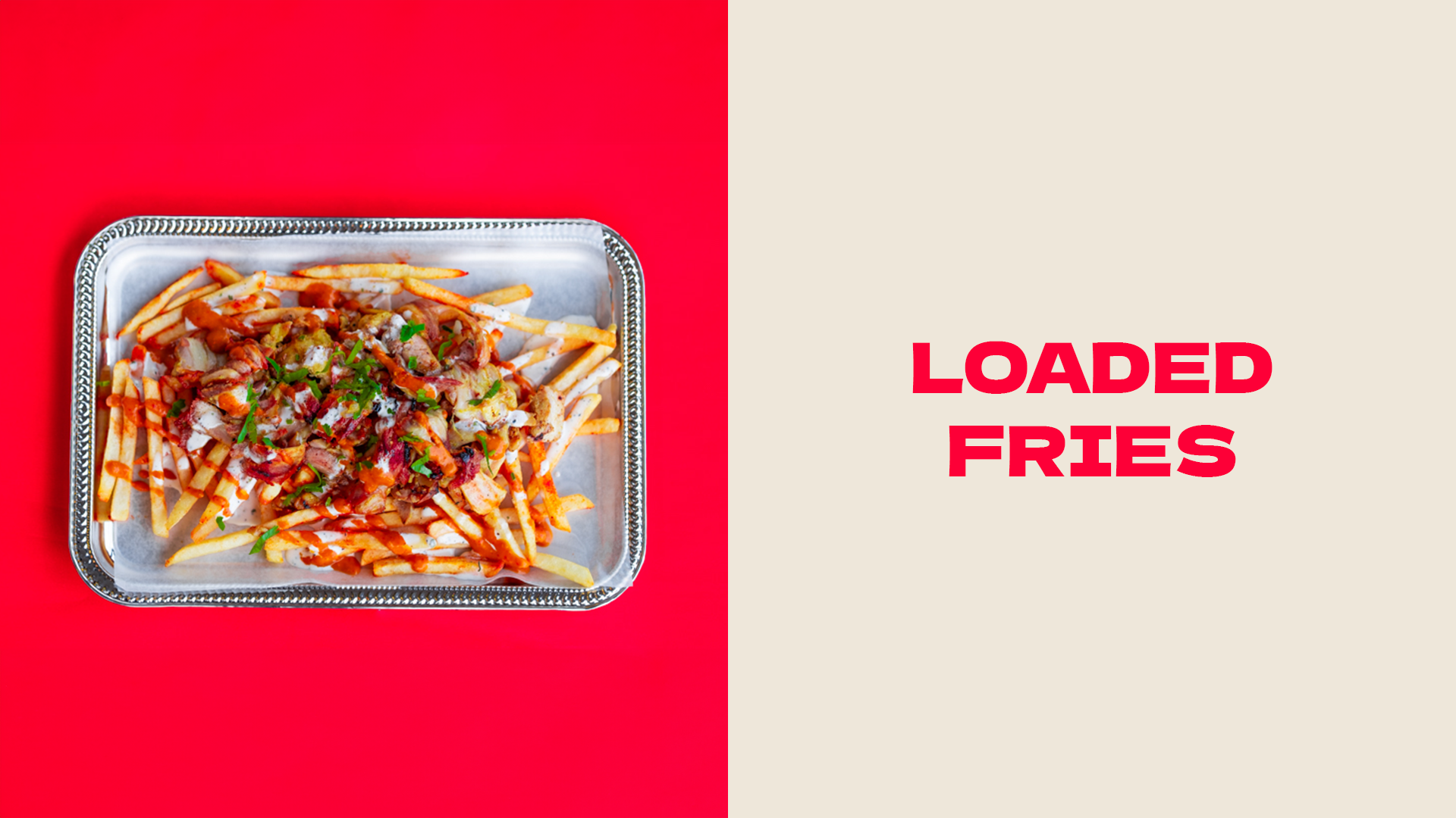
La Lucha is a restaurant in Monterrey Mexico that specializes in al pastor rotisserie chicken.
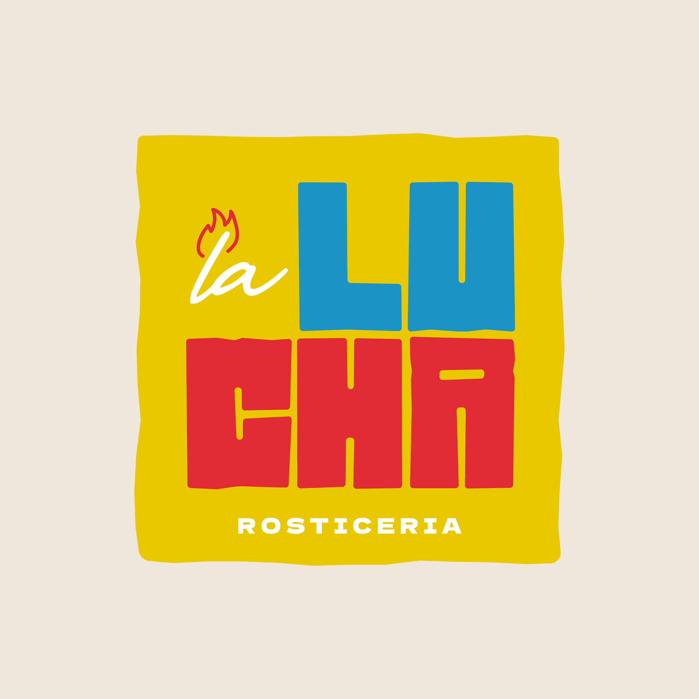
The logo itself was inspired by the delicious chicken that it is represetning. The rough edges of ‘Lucha’ is meant to symbolize the crispiness that comes from the fire roasting process of the chicken. The ‘la’ is a nod towards the flame, and the Comb that is on top of the chickens head itself.
The brand colors are inspired by the vibrant colors that can be found in the Mexican style professionsal wrestling, Lucha Libre.
La Lucha is a restaurant in Monterrey Mexico that specializes in al pastor rotisserie chicken.
The logo itself was inspired by the delicious chicken that it is represetning. The rough edges of ‘Lucha’ is meant to symbolize the crispiness that comes from the fire roasting process of the chicken. The ‘la’ is a nod towards the flame, and the Comb that is on top of the chickens head itself.
The brand colors are inspired by the vibrant colors that can be found in the Mexican style professionsal wrestling, Lucha Libre.